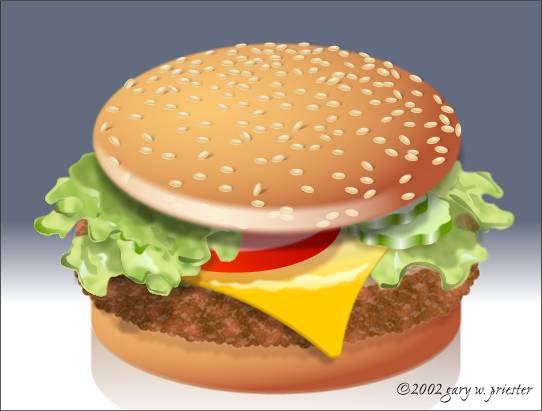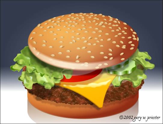

Here is the final image. I added a few touches that I really did not have the space to cover: a highlight on the cheese adds a more glossy look, some soft transparent shadows added to the lettuce create a little more dimensionally, a graduated background and reflection for drama, and a light crescent shape on the bottom of the sesame seed covered bun replicates the lighter portion of the hamburger bun.

And just because I can never leave well enough alone, I converted the entire image to bitmap, cloned the duplicate and applied an Elliptical, Stained Glass transparency switching the starting and ending transparencies which made the colors richer and more saturated. Yummy!
So what do you think, Joel? Is this what you had in mind? And what do you think, the rest of you? Was this tutorial helpful? Fun? Informative? Did you learn anything? Any questions, comments or kudos are always appreciated. Please use the response form on the next page to send me your feedback. These tutorials take a lot of time to prepare and it is always rewarding to get your feedback.
Gary W. Priester
Host
|
|
|
|
|
|
|
|