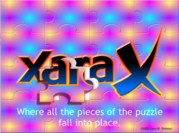

Here is the final image, a bit smaller than the actual size as it turns out. I made a few last minute alterations. First, I positioned the raised puzzle piece
down and left instead of up and right. I did this because the Xara X logo was easier to see this way. I also converted the raised puzzle piece to editable shapes and ungrouped the drop shadow. I re-selected the puzzle piece and
applied a new shadow this time using the Glow shadow option which added a dramatic reddish glow around the piece. All in all, I think this is a pretty impressive demonstration of Xara's new tools. I might have been able to
do a lot of this in Xara 2... if I had a few more weeks and twice as many pages. So, what do you think? Let me know on the next page. If you have any questions, comments, please let me know.


