
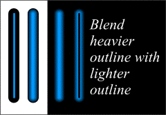
I've used a series of Blended outlines to create this flare effect. I began with a modest difference in line weights, 1 point for the blue outline on top and 4 point for the black outline on the bottom, and increased the weight on the bottom line to around 9 point, but it was so late at night when I created this I'm not certain what the actual outline weights are.
Page: 1 | 2 | 3 | 4 | 5 | 6 | 7 | 8 | 9 | 10 | 11 | 12 | 13 | 14 | 15