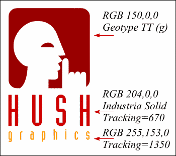
The lowercase g in Geotype TT symbol font is a pretty cool head with finger to lips to hush the public. What an appropriate symbol for HUSH Graphics. I've chosen non-dithering colors so the logo will appear sharp and clean on the Web as you can see here. I used a font called Industria Solid for the type with a generous amount of Tracking to space out the letters. To control tracking (the space between the letters) highlight the type you want to track and then click on the Tracking adjustment arrows on the Property Bar. To adjust Kerning (the space between individual letters), place the cursor between the two letters you wish to kern, then click on the Kerning adjustment arrows on the Property Bar.