 |
 |
 |
 |
 |
|
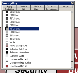 Daniel’s Have it your way TIP: In the Colour Gallery (press F9 to toggle open/closed) you can re-order the colours on the colour bar along the bottom of the screen. Daniel’s Have it your way TIP: In the Colour Gallery (press F9 to toggle open/closed) you can re-order the colours on the colour bar along the bottom of the screen.
Just click and drag a colour to the new location you'd like it to sit. This works for both default colours and custom defined colours.
The exact same method lets you change how the Layers are stacked: which I've been doing for 3 or 4 years, but never realized you could do it with Colours too.
[Editor’s Note] You can also arrange colors on the screen palette (The Color Line) by holding down the Ctrl key and dragging the selected color to a new location.
Related TIP: For reasons best known to Xara, it is not uncommon for the color palette (The Color Line) to fill with duplicate colors, for example, White 2, White 2,2 and so forth. Xara also adds a duplicate of any color selected from the color line at the end of the named colors and just before the web safe colors. You can select all these in the Color Gallery (F9) and delete them and tidy up your screen palette.
|
|
|
|
wALDO sLACK Non Printing TIP: If you don’t want something to print then put that layer on the background layer. Nothing on that layer prints regardless of whether it is visible or not. I discovered this some time ago & have adjusted all my Print template(s) accordingly. You can also create a new layer, for example for comments or reminders how you did something that you want to remind yourself of at some future date but do not want these comments to pint, then make the layer invisible and Xara will not print it.
|
|
|
|
Formatting multiple text TIP: If you select two or more text objects, you can globally change the formatting by selecting the Text Tool then making the desired changes on the Text Tool Infobar.
Select two or more text objects with the Selector Tool, select the Text Tool, make your modifications.
|
|
|
|
Math for the math challenged Need to divide an object into a given number of sections but don’t know where to multiply or divide what number by which? Let’s say you need to divide the blue rectangle into 8 equal sections. Create a row of 8 rectangles, each one the same size, and group them. Select the object you wish to divide into 8 sections and note the width on the Infobar. Reduce the grouped rectangles to the same width. Center it over the object to be divided and drag guidelines through the rectangles as shown above. You can use this for any number of divisions, just modify the number of rectangles.
|
|
|
|
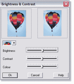 Wheel Mouse Slider Tip When you click on any of Xara’s sliders, such as the ones shown here in the Bitmap Effects Brightness and Contrast dialog (Utilities > Bitmap Effects and Plug-ins > Bitmap Effects), rolling the wheel on the wheel mouse moves the slider. Wheel Mouse Slider Tip When you click on any of Xara’s sliders, such as the ones shown here in the Bitmap Effects Brightness and Contrast dialog (Utilities > Bitmap Effects and Plug-ins > Bitmap Effects), rolling the wheel on the wheel mouse moves the slider.
|
|
|
|
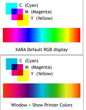 Displaying colors in CMYK mode. Displaying colors in CMYK mode.
The question frequently comes up in the Xara Conference, ”Why don’t my printed colors match the colors I see on the screen?”
There are many factors to consider but this tip of the week visually offers a clue and a solution.
Xara’s default color space is RGB in which colors display rich and bright. RGB colors when printed in the four process colors CMYK print darker and more muted.
To see what your colors will look like when printed in CMYK colors, select Show Printer Colors in the Window drop down menu.
|
|
|
|
Painted table top ©2001 Mary E. Carter
Lighten Up! Sometimes you have a photograph that is what photographers like to call “saturated” and I like to call, “too damn dark”. We here is a good way to lighten the photograph without losing the richness of color. Make a duplicate of the photo and in Xara, apply a Flat, 0% transparency. To brighten it even more, duplicate the transparent photo. The first 1/3 of the image above is the actual too dark photo. The center 1/3 is one image with Bleach transparency and the last 1/3 has two bleach transparencies.
|
|
|
|
Pete Duggan’s Imported GIF Transparency Background TIP: If you have an image with a white background that you want to make transparent, here is Pete’s TIP: Import the image, place over the white page and apply the stained glass transparency and export as a 256/16 colour transparent GIF/PNG. There'll still be a white anti-aliasing fringe, but the colours will be solid and the resulting image can be placed over any background. Whether the technique's any good to you depends largely on the nature of the image and what it's for, but it's certainly useful for some simpler shapes on some backgrounds.
If there is any white in the image itself, it too will drop out. You can get around this by placing a small white shape below the image before you export.
Top left: GIF with white backgound. Top right: GIF image with stained glass transparency. The white disappears but the background image shows through. Bottom: The GIF with 100% Stained Glass transparency, exported over a white background with the Transparency option checked and then imported and placed over the clouds image.
|
|
|
|
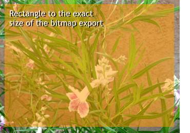 Surefire cropping tip: Resizing a bitmap to even pixel amounts can be tricky and sometimes produces images with soft edges. Surefire cropping tip: Resizing a bitmap to even pixel amounts can be tricky and sometimes produces images with soft edges.
If you create a rectangle with no outline to the exact size you want your image to be, position it over the bitmap, (add transparency so you can see the image underneath) then set the fill to none. Export the image as a JPEG or GIF and Xara will export the image to the exact size of the rectangle. If you are exporting as a GIF disable the Transparent Background option (the wineglass icon).
|
|
|
|
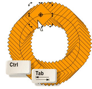 Rotating a hidden image in a blend tip: The end image in the blend shown here is hidden by the object on top. You can Ctrl click then press the Tab key to access the hidden shape but if you cannot rotate it. To rotate the hidden object, Ctrl click the visible end of the blend twice to enable rotate/skew mode, then press the Tab key. The hidden shape is now selected and the rotation/skew handles are enabled. Rotating a hidden image in a blend tip: The end image in the blend shown here is hidden by the object on top. You can Ctrl click then press the Tab key to access the hidden shape but if you cannot rotate it. To rotate the hidden object, Ctrl click the visible end of the blend twice to enable rotate/skew mode, then press the Tab key. The hidden shape is now selected and the rotation/skew handles are enabled.
|
|
|
|
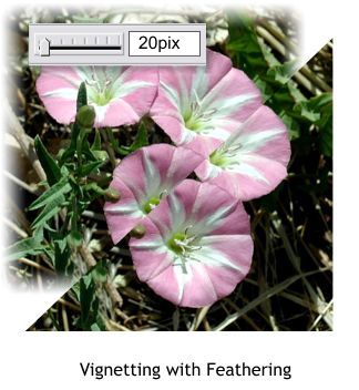 You can vignette (add a soft edge) a photographic image by applying feathering using the Change Size of Feathering Region slider on the Infobar. You can vignette (add a soft edge) a photographic image by applying feathering using the Change Size of Feathering Region slider on the Infobar.
Experiment with the settings until you find the best setting.
|
|
|
|
Constraining drawing and resizing TIP: Hold down the Shift and Ctrl keys when drawing a rectangle or ellipse to draw the objects from the center and to constrain the shape to a square or circle.
Hold down the Shift key to resize from the center of the object.
|
|
|
|
John Clements who works with complex drawings with thousands of elements has this weeks tip on selecting multiple objects and objects within groups without using Ctrl or Ctrl Shift (the other method). John advises:
You can select objects within multiple groups and within groups inside other groups, in Clip Views, or in Button Bars WITHOUT Ctrl or Ctrl+Shift selecting.
If the desired objects are all given the same NAME then, in the Name Gallery, you can select that name and all objects associated with that name will become selected even when they are contained in Groups, in a Clip View, or even Button Bars!
Related Bonus TIP: Another very cool extension of this idea is in managing labels (text). If the text is Centered and used for a label or contained in an Autoexpanding Button Bar, then you can ***"Scale" all your text at once*** and still maintain its relative alignment within your drawing .... just select the font name shown in the Name Gallery and then change the Font Size (or Color or Font Style) via the Text Tool Infobar.
|
|
|
|
Best non-Xara-related TIP of the Year! If you use Windows XP and or Microsoft Internet Explorer, you may have noticed the helpful way in which as soon as you key in a few characters, a drop down appears with previously entered material. In the example above you can see that keying in a g in the e-mail address text entry window automatically drops down a list of my e-mail addresses. The bottom address is not correct and was entered by mistake but appears every time regardless. Here’s how to get rid of it according to Graeme Davidson. Highlight the entry and press Delete. That’s it! Simple and effective! |
|
|
|
We’ll Never Get Rich this Way TIP: Mike Hennessey suggests: I don't recall seeing this mentioned before, but if it has please forgive me. Grant has left the option available to convert The CD (The CD containing all the Xara Tutorials and WebXealots/On-Line Xara X Manual) back to a read/write disc. I was able to do this using Direct CD. Not all of you may find this as useful as I, but I then created new folders on the disc for the 2002 tutorials and Gary's new workbook series. All of my Xara related training and reference materials are now on one disc. Thought maybe some of you would find this beneficial.
|
|
|
|
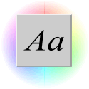 Previewing Text styles and sizes TIP: Miles e-mailed me this tip. If you want to preview text, the text does not have to be highlighted. Just select the text with the Selector Tool, drag and right click to drop a duplicate, then select fonts from the Font drop down list on the Infobar and the text changes automatically. Same goes for font Size. To apply another font, just open the fonts drop down list again. Previewing Text styles and sizes TIP: Miles e-mailed me this tip. If you want to preview text, the text does not have to be highlighted. Just select the text with the Selector Tool, drag and right click to drop a duplicate, then select fonts from the Font drop down list on the Infobar and the text changes automatically. Same goes for font Size. To apply another font, just open the fonts drop down list again.
|
|
|
|
If you have a dull bitmap of your client’s logo, or any black and white image (grayscale) and want to add some spice to the image here’s how you can add color and a drop shadow. Select the bitmap and right click on a color on the screen palette to change the color. The add a Stained Glass transparency. You won’t see any difference. But then add a shadow with the Shadow Tool. Neat huh? There’s more.
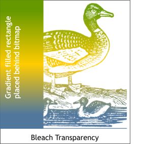 Stained Glass transparency makes the white background transparent and because Xara’s drop shadows are sensitive to transparency, you just see the shadow for the non-transparent part (the line art). Stained Glass transparency makes the white background transparent and because Xara’s drop shadows are sensitive to transparency, you just see the shadow for the non-transparent part (the line art).
Bleach transparency makes black transparent. So if you place a gradient color filled shape behind the bitmap, and apply Bleach transparency, the colored gradient shows through the black line art.
|
|
|
|
Understanding Fill Effects: This is not as much of a tip as it is an explanation of how Xara’s Fill Effects work. The three settings are Fade, Rainbow, and Alt Rainbow. Here is how each works.
Fade Is a blend of one color into a second color.
Rainbow creates a gradient fill taking the shortest path around the outside of the color wheel.
Rainbow creates a gradient fill taking the longest way around the color wheel.
To create a complete rainbow, use the same start and end color.
To create a very pastel rainbow, use the same very pale color, such as a very pale yellow.
|
|
|
|
 Text Tool TIP: To edit text without having to first select the Text Tool icon, right click on any editable text and select Text Tool from the pop up menu. Text Tool TIP: To edit text without having to first select the Text Tool icon, right click on any editable text and select Text Tool from the pop up menu.
Bonus Text Tool TIP: To select an entire block of text, insert the Text Tool cursor in the text and press Ctrl a (Select All). To deselect the text, press Esc.

|
|
|
©The Xara Xone
|
|