 |
 |
 |
 |
 |
 |
 |
 |
Xara X. The Button and Navbar Tool
When the Button and Navbar Tool is
selected the following options appear on the Infobar at the top of the screen. New... creates a new button from the selected shape (a separate tutorial will follow on the next page) and determines the number
of buttons, the space between buttons, their orientation (horizontal or vertical) as well as how the buttons will react in the various button states. Bar Properties...
opens almost the same dialog menu as New and can be used to modify the buttons. An option to create a Back Bar is also present. Create/Delete States opens a dialog that can automatically creates up to four button
states: Mouse Off, the appearance of the button when the page first loads, Mouse Over, the appearance of the button as the mouse passes over it, Mouse Down, the
appearance of the button when the left mouse button is pressed, and Selected, the appearance of the button indicating the currently selected page. Any state can be deleted and recreated. Set New Design...
Assigns the appearance of any of the four auto-generated states as the initial Mouse Off state. The Show Buttons in a Given State drop down list shows the appearance of each
button state once all states have been created. Also included are options to display All States and No States. All States must be selected before Exporting the button bar. Live Stretching
, when selected, expands the width of the button uniformly to accommodate longer text. All buttons stretch to accommodate the widest measure of text. Export
creates the JavaScript for the button rollover effects and generates the necessary HTML script, which can be used as is or copied and pasted into your Web page construction software.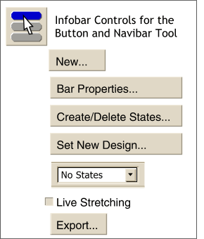 The Button and Navbar Tool is used to
create navigational buttons and button bars for Web pages. Xara can automatically create sophisticated JavaScript rollover effects as well as generate the necessary HTML scripts.
The Button and Navbar Tool is used to
create navigational buttons and button bars for Web pages. Xara can automatically create sophisticated JavaScript rollover effects as well as generate the necessary HTML scripts.
Using this dialog you can determine (or edit): the Number of Buttons, whether the buttons are arranged horizontally or vertically, the space between buttons. Button Stretching
determines whether the rollover action changes the size of the button or not. Buttons are All determines whether the buttons are all the same size or not. Make BackBar from Backmost Object appears when the New...
button is first pressed. When Bar Properties... is selected this option become Create BackBar from Selection. Either option includes a user
defined shape behind the buttons in the final Export. When the BackBar object is created in the New... dialog, it automatically stretches to accommodate the number
of created buttons. When the Create BackBar from Selection option is selected in the Bar Properties... dialog, the BackBar is static and does not change. Groups Do Not Stretch
is used to prohibit grouped objects from stretching. The Help button provides context-sensitive information about the contents and options in any open dialog.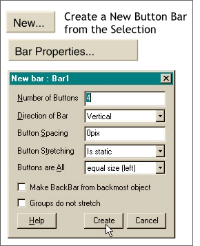 Pressing New... or Bar Properties...
opens the dialog shown on the left.
Pressing New... or Bar Properties...
opens the dialog shown on the left.
New State is a Copy creates all buttons alike and permits the user
to modify the individual states. On the next page you will find a brief tutorial for creating a button navbar and a back bar.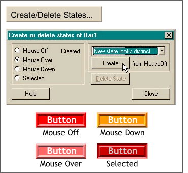 Create/Delete States creates the appearance of the selected button. Options are New State Looks Distinct and New State is a Copy. New State Looks Distinct
automatically creates up to three new states based upon the colors in the original (Mouse Off) button. See the example of the four buttons on the left.
Create/Delete States creates the appearance of the selected button. Options are New State Looks Distinct and New State is a Copy. New State Looks Distinct
automatically creates up to three new states based upon the colors in the original (Mouse Off) button. See the example of the four buttons on the left.