|
 Resize
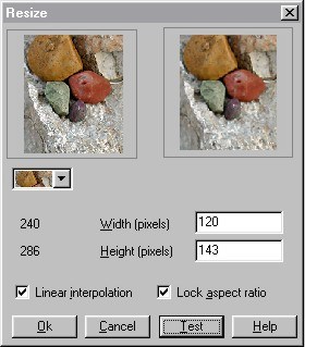
is a very curious effect to say the least. I would expect, and I suspect we all would expect, that reducing the Height and Width by one half, as shown on the left, would
produce an image that is exactly one half the size. Right? Resize
is a very curious effect to say the least. I would expect, and I suspect we all would expect, that reducing the Height and Width by one half, as shown on the left, would
produce an image that is exactly one half the size. Right?
When you press OK, however, the resulting image is the same size. So what gives?
Xara displays the image the same size while in reality the image is only half the size in terms of pixel dimensions. If you exported this
image and loaded it onto a web page, the image would be the size it is shown here in pixels or half the size. Odd, or what?
Linear Interpolation is an algorithm used in determining what pixels to keep and which to discard when reducing the image. It is recommended
in the context-sensitive Help menu that you use this setting as a "chunky" image may be the price to pay for not using the option. (Why is it an option, then?) Who wants a chunky image? I don't do you? Lock
aspect ratio forces the image to scale in the same height to width ratio as it currently is. Not using this option lets you scale the image non-proportionately, for example, you could make the image taller and
maintain the same width.
You can also use this to enlarge an image by increasing the size values. In this case the Linear Interpolation routine decides how best to
arrange the extra pixels to produce the best image.
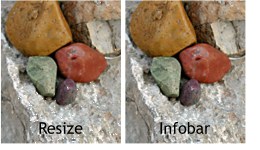 So why would you use this resizing
dialog when you can do the same thing entering values on the Infobar? Beats me. The two images on the left were resized by 1/2. The image on the far left, which was resized in the Resize
dialog, then reduced to the actual pixel amount, is not as sharp as the image reduced by entering 50% on the Infobar. The result is the resizing algorithm used in resizing from the Infobar, or
in the bitmap export dialog, produces superior results. So why would you use this resizing
dialog when you can do the same thing entering values on the Infobar? Beats me. The two images on the left were resized by 1/2. The image on the far left, which was resized in the Resize
dialog, then reduced to the actual pixel amount, is not as sharp as the image reduced by entering 50% on the Infobar. The result is the resizing algorithm used in resizing from the Infobar, or
in the bitmap export dialog, produces superior results.
|

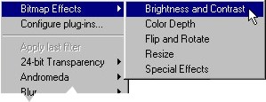 The Bitmap Effects section is
divided into five areas, shown on the right in the Bitmap Effects fly out menu. I'll cover them in the order of appearance in the fly out menu.
The Bitmap Effects section is
divided into five areas, shown on the right in the Bitmap Effects fly out menu. I'll cover them in the order of appearance in the fly out menu.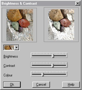 Each of the menu selections opens a
separate dialog which consists of a before and after window, some slider adjustments, a drop down list of bitmaps (this is the same list found in the Bitmap Gallery) and the usual
buttons including context-sensitive Help which explains the contents of the dialog. Many dialogs also have a Test button which is in effect a Preview effect button. The first menu
item is probably one with which most of us are familiar, Brightness and Contrast.
Each of the menu selections opens a
separate dialog which consists of a before and after window, some slider adjustments, a drop down list of bitmaps (this is the same list found in the Bitmap Gallery) and the usual
buttons including context-sensitive Help which explains the contents of the dialog. Many dialogs also have a Test button which is in effect a Preview effect button. The first menu
item is probably one with which most of us are familiar, Brightness and Contrast.
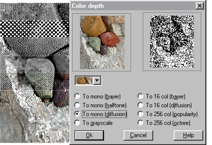 There are eight Color Depth settings. Color
depth refers to the number of bits needed to display a color. Most full color photo images use 24-bits of information to describe color, 8 bits (256 values) to describe the red, green, and blue components of a
color for a grand total of 16.7 million colors in all (256 x 256 x 256 = 16.7 million give or take a few).
There are eight Color Depth settings. Color
depth refers to the number of bits needed to display a color. Most full color photo images use 24-bits of information to describe color, 8 bits (256 values) to describe the red, green, and blue components of a
color for a grand total of 16.7 million colors in all (256 x 256 x 256 = 16.7 million give or take a few).
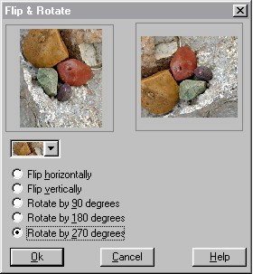 Flip and Rotate There are no
surprises here. It is just as easy to produce these results on the Infobar and there is no need to dig through the menus to get there.
Flip and Rotate There are no
surprises here. It is just as easy to produce these results on the Infobar and there is no need to dig through the menus to get there.