|
|
|
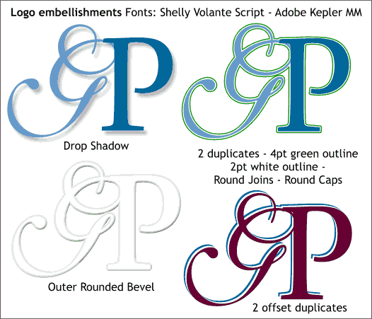
Once you find a combination of letters that work well for your needs, here are some simple embellishment techniques. In the top left example, the two characters are grouped, and a simple Wall Shadow applied. Simple but tasteful. The version to the right is three separate grouped characters, centered. The bottom group has a 4pt green outline. The middle group a white 2pt outline and the top group has no outline. NOTE: I prefer the outline technique to a 2-step Contour effect. Applying a Contour effect to the text corrupts the character's outline shape. (Bug or Feature? You decide). The group on the bottom left have an Outer, Rounded bevel applied. The characters were filled 10% black. Once the bevel was applied, white was dragged and dropped form the screen palette onto the characters creating a white on white embossed look. The example in the lower right is three groups of characters. The three groups are offset 2 pixels right and down from each other. The center group is filled white creating a stroked outline effect.
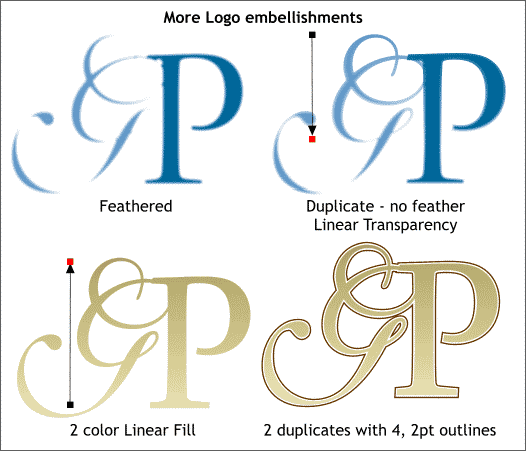
Some experiments. The top left group have been feathered using the Change Size of Feather Region slider on the top right area of the Infobar. The next example uses a combination of a feathered and un-feathered group. Linear transparency applied to the un-feathered group goes from sharp to out of focus. The bottom left example uses a 2 color Linear fill of two gold colors to create a gold effect. And the bottom right example uses the outline technique discussed in the previous image.
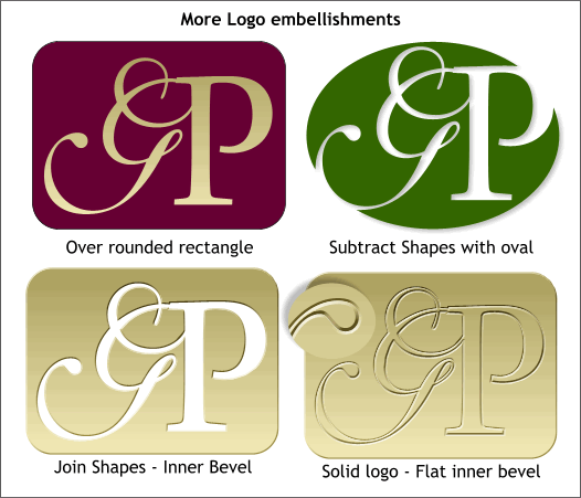
Moving along, here are some fancier techniques. Top left is the gold filled logo placed over a burgundy filled rectangle with rounded corners. Top right is an ellipse from which the text has been subtracted (Combine Shapes... Subtract Shapes) and with a Wall Shadow applied. Lower left is the same idea but with the logo subtracted from the rounded rectangle and a small Inner bevel applied. And the lower right example is the same logo but with the gold logo from the top left example, placed over the open area and a Flat, Inner bevel applied. This is fun, don't you agree?
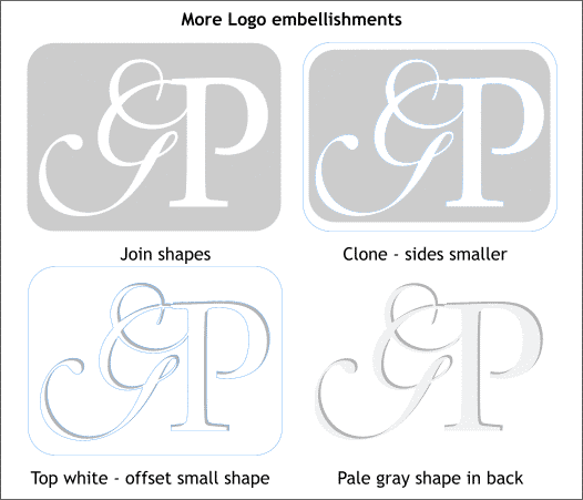
This final approach creates a cut out effect with a drop shadow. The top left example is the logo subtracted from the rounded rectangle. The top right example has a cloned copy of the logo with the sides moved closer to the center with the Shape Editor Tool. This smaller shape is filled gray, the larger shape is filled white (bottom left). The gray filled shape is moved down and to the left then sent to the back (Ctrk b ) to create a shadow. The top white image hides all but the shadow portion of the gray version. And finally, a pale gray rectangle that covers just the logo area is sent all the way to the back. None of the shapes has an outline. This creates a white on white effect with cut out letters. You can modify this technique to use any color or texture. You could even do it with a photograph as shown below.
|
||
|
|
