|
|
|
I used to be known as The Makeover Maven, but in another lifetime. I would take people's logos and then give the logos a makeover. But that was another lifetime. I still create logos to supplement my income, and to be honest, it is one of the design processes I enjoy the most. Lots of people ask me to help them design a logo. If money were no object they would pay my very modest fee, but money is always an object, isn't it? So, today, for free, I'm going to show you how you can work with simple type faces to create your own typographical logo. Then your editor (yours truly) will show you how to apply your logo to a business card, a letterhead and an envelope. Finally, you'll learn how to export the business card as a PDF (Portable Document File), a format preferred today by most printers. And don't worry about not having the money to purchase Adobe's Acrobat program, we'll use PDF995, a freeware-shareware program.
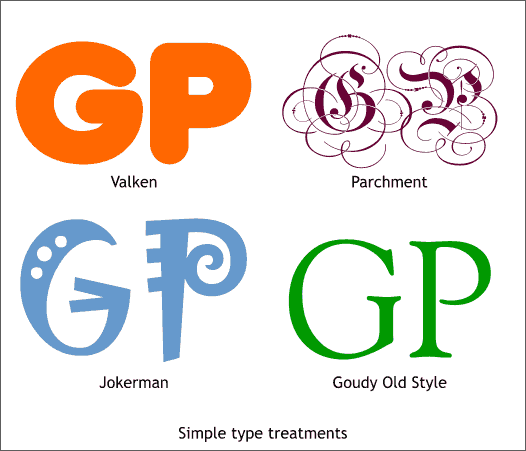
Let's pretend we are creating a logo using the initials, GP. One of the first things I always explore is how will the characters look when different fonts are applied. You may not have all the fonts I am using, but that's OK. Just use whatever you have installed on your computer. Notice how each font gives a different character to the logo. From fat and sausage like, to ancient and flowery, to semi avant garde to stylish and elegant. There are thousands and thousands of fonts, and each one will add a different nuance. You just need to find the font that works best for you. TIP: There are a few hundred fonts on the Xara X1 disc. In addition you can visit BuyFonts.com where you can find fonts priced from $2 to $16 US.
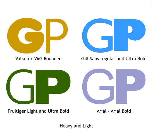
This is my Yin and Yang approach. Pairing a heavy and light font together. It sometimes works better with some characters than others. In this case It does not appear to work, so lets move on.
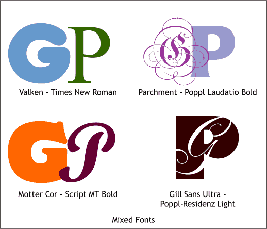
Mix and match. Ladies know how to do this intuitively. We men need to work a bit harder at it. In this approach, different fonts are used. Contrasting elegant with bold often produces a nice effect. The light script with the heavy font in the lower right is interesting. A white-filled script G is placed in front of the P. The script G could also be subtracted from the P (select both characters and Arrange > Combine Shapes... Subtract Shapes).
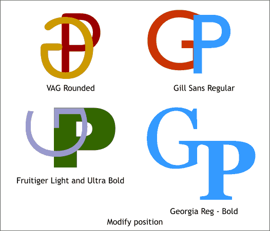
Sometimes if you modify the position of one of the characters you can create an unexpected effect either by offsetting the two characters or rotating one of the characters.
|
||
|
|


