|
Part Three - Individual Flame Shapes
Important Note: unless otherwise stated, all freehand drawn flames have a:
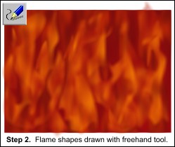
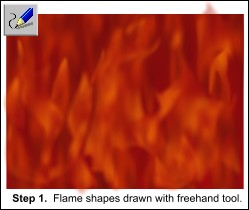
 Fractal Plasma fill - Repeating, Fade, 80 dpi, Fractal Scale 30. Fractal Plasma fill - Repeating, Fade, 80 dpi, Fractal Scale 30.
 Fractal Plasma transparency - Repeating, Mix, 54 dpi, Fractal Scale 30%. Fractal Plasma transparency - Repeating, Mix, 54 dpi, Fractal Scale 30%.
With a 6 pixel feather. And normal profiles.
I usually work with the 'give new objects most recent value' so this is just the way it happened (So to make these next steps easier, click on: File
menu > Page Options > General > Give new objects most recent value).
 Tip: If you change the feather settings for a new object it is possible that Xara won't give
your next objects the same feather. A way around this is to copy the feathered object, that you wish the settings passed on, then Paste Attributes (CTRL+SHIFT+A or Edit > Paste
Attributes) to the next object - this seems to give Xara the idea of putting the same feather on subsequent objects, not sure why this happens. Tip: If you change the feather settings for a new object it is possible that Xara won't give
your next objects the same feather. A way around this is to copy the feathered object, that you wish the settings passed on, then Paste Attributes (CTRL+SHIFT+A or Edit > Paste
Attributes) to the next object - this seems to give Xara the idea of putting the same feather on subsequent objects, not sure why this happens.
NOTE:
The Paste Attributes icon shown above is not found on the Infobar by default. You can add this icon to your setup by going to Window > Control Bars > Button Palette. For more
information, refer to the Help menu in the Control Bars dialog.
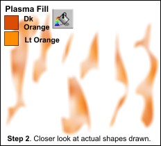
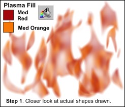
Both fills and transparencies had the vertical handles longer than the horizontal ones (I believe
I drew the first shape as solid and no transparency, then set the fill/transparency to fractal plasma, set the dpi and just reduced the horizontal handle inwards).
|