|
 This example shows how
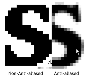
Anti-aliasing works. The S is the S in the bitmap logo enlarged 1000%. Without Anti-aliasing, the text is jagged and stair-stepped. This example shows how
Anti-aliasing works. The S is the S in the bitmap logo enlarged 1000%. Without Anti-aliasing, the text is jagged and stair-stepped.
Anti-aliasing adds subtle intermediate shades of color (in this case shades of gray) which when viewed actual size are not apparent. But the end result is a
smoother appearance which oddly enough, makes the object appear sharper and crisper.
When Xara traces the bitmap it has to make a determination of which of these Anti-aliased pixels to count as the object's outline, and which to ignore.
Xara uses a set of algorithms that meet a general criteria for a type of bitmap which it feels will give the best results while at the same time
not creating too many points on each object. (Too many points increase the file size and may fail to print on some older PostScript output devices). And while these settings are serviceable, with tweaking, we
can do better.
 You remember Tad Bridenthal advised us to
take notes and more notes when tracing. Following Tad's advice, I have recorded my settings as you can see in these examples. You remember Tad Bridenthal advised us to
take notes and more notes when tracing. Following Tad's advice, I have recorded my settings as you can see in these examples.
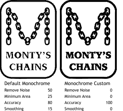
The Monochrome trace option is found in the Trace types drop down list (under Photographic, the default trace method) and produces a
one-color trace result. While the default settings produces a pretty OK result (left), reducing the Noise and Minimum area settings to 0, bumping the Accuracy setting to 100
, and reducing the Smoothing setting to 0 produces a better result, at least where the type is concerned.
|

 For this exploration of Bitmap Tracing settings
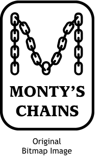
we will use this black and white bitmap logo for Monty's Chains, a fictitious company invented by your editor for this exploration. As revealed on the previous page, although this image looks
like it is only black or white, there are many intermediate shades a gray used to smooth the outline of the text and logo elements.
For this exploration of Bitmap Tracing settings
we will use this black and white bitmap logo for Monty's Chains, a fictitious company invented by your editor for this exploration. As revealed on the previous page, although this image looks
like it is only black or white, there are many intermediate shades a gray used to smooth the outline of the text and logo elements.
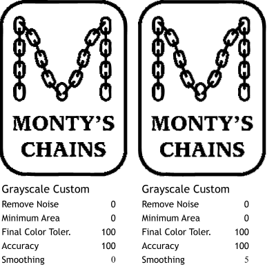 I decided to experiment
with some of the other trace methods, and for these two examples, used the Grayscale tracing method.
I decided to experiment
with some of the other trace methods, and for these two examples, used the Grayscale tracing method.
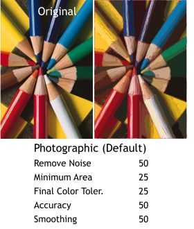 Tracing a color photographic image
using the default Photographic tracing options produces a relatively acceptable image (right side).
Tracing a color photographic image
using the default Photographic tracing options produces a relatively acceptable image (right side).
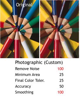 Increasing Remove Noise to 100 and
Smoothing to 100 should have reduced the red slivers. And while it did a little, it did not reduce them enough to make the image any better. The highlights on the pencils turned
out a little bit cleaner however.
Increasing Remove Noise to 100 and
Smoothing to 100 should have reduced the red slivers. And while it did a little, it did not reduce them enough to make the image any better. The highlights on the pencils turned
out a little bit cleaner however.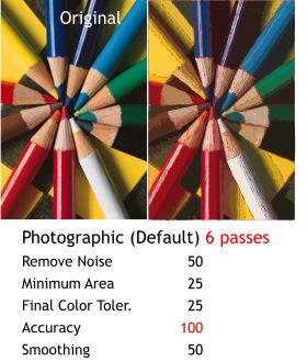 Theoretically, adding more passes
should produce a more accurate image along with pushing the Accuracy setting all the way to 100.
Theoretically, adding more passes
should produce a more accurate image along with pushing the Accuracy setting all the way to 100.
 Why would you want, or need, to trace
a color bitmap image anyway?
Why would you want, or need, to trace
a color bitmap image anyway?