|
|
|
I received over a dozen responses to last month's discussion of Xara's Text Tool. So I thought it might be useful to take this discussion further and examine type in a little more detail. A Font is a single showing of characters in a single style and a single weight. A Style can be Roman or Italic and variations. A Type Family is a group of fonts with the same characters but in different styles. The most common type families in Windows usually consists of 4 fonts: Regular, Italic, Bold, and Bold Italic. In the old days when there were actual persons who set type, it was not uncommon for a type family to have up to a dozen or more fonts ranging from light to black or extra bold. Many years ago, Adobe introduced Multiple Master fonts that designers could use as the basis for creating an infinite number of fonts. Many Multiple Master fonts had controls for size, weight, and width. The possibilities were endless. But almost from the start, there were cross platform problems. A font saved in a Windows file would not appear correctly (or at all) on a Mac, even though both computers had the exact same fonts installed. More recently, Adobe and Microsoft have developed Open Type. Open Type has cross platform compatibility (an open type font specified on a Mac will now be recognized in Windowsif the same font is installed on both machines). Another advantage of Open Type is support for a much large number of characters and "glyphs". Previously, fonts were limited to 256 characters. Open Type fonts support up to 65,000 glyphs or characters. The major benefit of this support is characters for many languages can be included in one font. Also many fonts/styles can be included in a single font so you can have roman and italic fonts, a variety of weights, and in many cases, a range of old style characters.
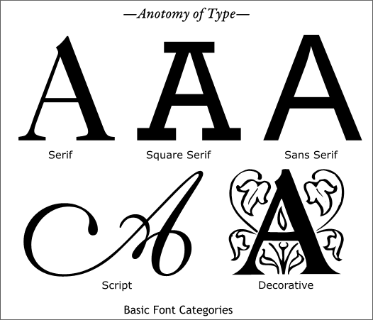
Font styles can be broken down into a few main categories as shown above. Each of these categories can in turn be broken down into many additional subcategories.
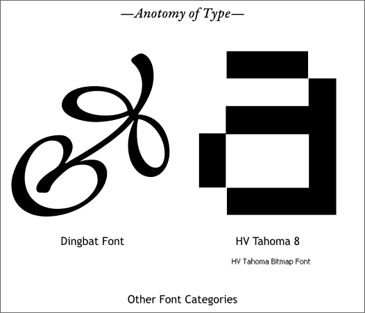
A font subcategory is Dingbats such as the decorative character shown on the left from the Minion Ornaments font. Zapf Dingbats, which is installed on just about every computer in the world, is another Dingbat font. The web has inspired another category of font called bitmap fonts. These fonts are designed to be displayed at a specific size, usually very small. The greatly enlarged lowercase a on the right is from a bitmap font, HV Tahoma 8 designed by Rubem Pechansky and available for free from the Shareware Page. The advantage of these bitmap fonts is they can be displayed in very small sizes on the web and still remain readable (well if you have good eyes).
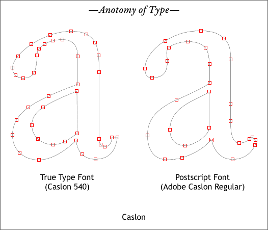
Adobe was one of the first companies to create scalable fonts for the computer. These fonts are called Postscript Fonts and as opposed to bitmap fonts, Postscript fonts can be scaled up or down to almost any size without losing the integrity of the character. Another category of digital fonts is True Type, which is the standard font format for Windows. True Type fonts tend to use a few more control points than Postscript fonts as you can see in the examples above. These two fonts are similar but show a difference in design. This is very common. You might find several dozen versions of Caslon and all will be slightly different. Fonts cannot be copyrighted, oddly enough, although the digital files can be.
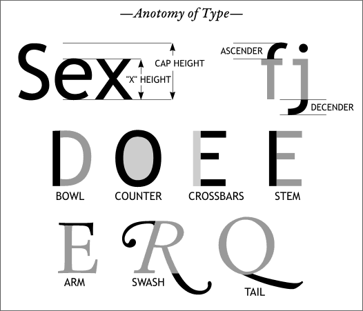
There are dozens of terms type designers use to describe different parts of a character, some of which you can see here. Click here for more.
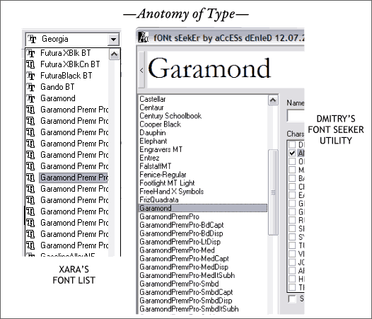
Switching gears, one of the frustrating things when using Xara's Fonts drop down list (shown on the left) is it is often difficult to identify a font name that has more than about 20 characters. One of my Open Type fonts is Garamond Premier Pro. All of the names get cut off before I can tell what they are. And since there is no way to preview the font (except using the Font Gallery, and even there the font names are truncated). Access (Dmitry Malutin) to the the rescue. Dmitry's Font Seeker (available for free in the Shareware Page) lets you key in some text in the upper window and then preview the text in all of your your installed fonts as well as see the entire name of the font.
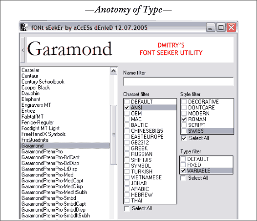
The latest version of Font Seeker now expands to let you search for fonts by Character, Style, and Type. It's pretty incredible, and it has really made my life easier. Also, if you can't remember the name of a font, but have a few letters, Cas, for example, Font Seeker will look through all your fonts and find fonts that start with Cas such as Caslon and Castellar. Great work, Dmitry!
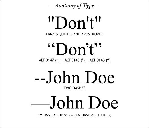
Most of you already know this, but for those of you who don't, when you type an apostrophe or enclose a word or phrase in quotation marks, Xara uses the tick marks for inches (quotes) and feet (apostrophe). Nothing screams amateur louder than not using proper curly quotes and apostrophes. I have even seen type in TV commercials using tick marks in place of an apostrophes! Windows has extended characters that let you use the proper marks and they are listed above. For example, to insert an apostrophe, and with Num Lock enabled on your keyboard's keypad, hold down the Alt key and key in 0146 on the numeric keys on the keypad. For a more complete list of extended characters including the copyright symbol and circle R registered symbols, scroll down to the bottom of the TIPS 4 page. Did I leave anything out? Or is there something else you would like covered? Let me know and I'll cover it in the next Workbook.
|
||
|
|
