|
|


|
Coloured Backgrounds I experimented with using the droplets on other coloured/bitmap filled backgrounds. There is no hard and fast rule for the settings to use - it depends on the background colour and darkness. It is simply a matter of increasing or decreasing the transparency values of the droplet objects. Here is an very quick example of the droplet on the Bluetiles.jpg fill in the Bricks folder (Fill Gallery > Brick Textures) or which you can download from xara.com website. They both took only a few minutes to adjust from the Part I droplet, although I suspect I will still be tweaking them in the near future
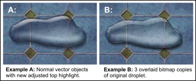
Example A: is the droplet as vector objects, there is no bevel in these examples as per the optional extras in last month's tutorial. I have decreased some of the transparency settings of the black shading objects (mostly using a stained glass transparency) and made them a very dark blue. Then I increased the transparency of the white highlight objects (using bleach transparency) and changed them to a light blue. I believe that I got the blue colours from opening the colour editor (small multi-coloured icon - bottom left of your screen) and used the colour picker to get the same blue hues from the background bitmap, then in the HSV colour model just darkened and lightened this hue etc. Example B: is a slightly easier way of creating this. I made a bitmap copy (Arrange > Create Bitmap Copy or Ctrl+Shift+C), using True Colour and Alpha (png). I then gave it a flat stained glass 0% transparency. This was too faint so I cloned it. Then I cloned again and used a flat brightness 64% transparency, which added a bit more shading and also gave me the white highlights. As the droplet is only shading and highlights this method works fairly well using two or more types of transparency. Note: I wasn't very happy with the original top highlight so here (Example A) I experimented with some adjustments to soften the main highlight bottom edge using a higher feather (3 pix) and added another slimmer upper highlight with a lower feather (2 pix) to keep the top edge harder. Using a clipview for a highlight that is an awkward shape is another probably more effective option to get a better fade out on the bottom and the harder edge at the top.
|
|||||
|
|
|||||
|
©2003 Su Lawrence All rights reserved
|
|||||
|
|
|||||