|
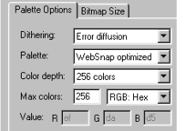 The last area of the Bitmap Options
dialog we need to look at is the Dithering:, Palette:, and Color Depth: options. The last area of the Bitmap Options
dialog we need to look at is the Dithering:, Palette:, and Color Depth: options.
When TrueColor or TrueColor + Alpha are selected, Color Depth:, Dithering: and Palette: are grayed out.
Dithering, as you may remember from Page 2, is a processes of creating patterns of colored dots, that when placed next to other colors can simulate intermediate colors. For the most part, dithering an image
with 256 colors, makes little difference in image quality, but it does increase the file size. Sometimes considerably.
Why? Well, if you remember my comparison of bitmaps and vector images, I described the method a bitmap uses to describe the color of each pixel. GIF
images, use a compression scheme in which rather than give the same pixel color description for each pixel in a solid area of the same color, the GIF image says pixels x-y are color such and such. In
some cases, this can result in a much smaller file size. When dithering is used, the tiny color patterns of pixels break up the large blocks of the
same colored pixels and so more descriptions of individual pixel colors is required.
 The image shown here (the red thing is a chili
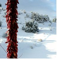
ristra) is a TrueColor 24-bit JPEG color image. With about 20% compression the file size is 10K and the image is very smooth. For a photographic image, this is definitely the way to go. The image shown here (the red thing is a chili
ristra) is a TrueColor 24-bit JPEG color image. With about 20% compression the file size is 10K and the image is very smooth. For a photographic image, this is definitely the way to go.
But what if you are placing text on top of the image. Some of our examples of text and solid areas of color in JPEG images that we saw on Page 3 produced blotchy areas of color. In this case a
256 color PNG image might be better.
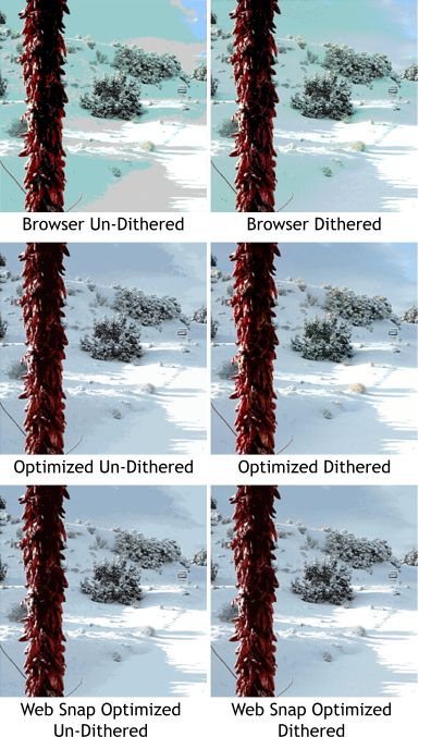
Now we get to limited color palettes and dithering. The three pairs of images shown below were produced from the TrueColor image above.
All use the minimal 16 Color option and all are just about the same file size, 19K which oddly is almost twice the size of the TrueColor JPEG image.
 The three palette options that are
available when the image to be created uses 256 colors or less are: Browser, Optimized, and Web Snap Optimized. The three palette options that are
available when the image to be created uses 256 colors or less are: Browser, Optimized, and Web Snap Optimized.
The Browser option uses the most appropriate Web Safe colors (a very limited palette of 216 colors). The reds in the ristra look OK but the snow
has turned a ghastly shade of green. The dubious benefit of the Browser palette is anybody with a monitor capable of displaying no more than 256 colors at one time (and I cannot think there are many of
these around any more) will see the same ghastly green snow).
The Optimized palette selects the best colors to display the image. The reds in the ristra look better in the dithered version and the
clouds are smoother. Optimized is my choice for creating 256 color images.
Web Snap Optimized tries to split the difference. Whenever possible, a Web Safe color is used to assure consistency across the board. Again
the dithered version is smoother but the reds in the chili ristra are not quite as red as in the optimized version.
 Here are the three sets of palette
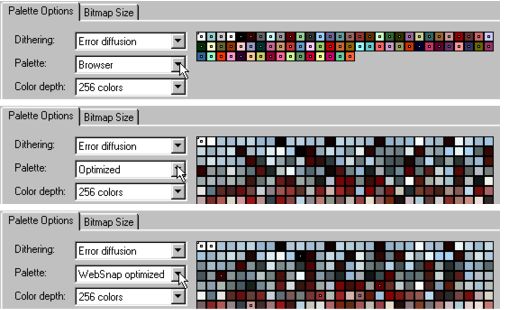
colors. I increased the colors to 256 so you can see each one. Here are the three sets of palette
colors. I increased the colors to 256 so you can see each one.
The Optimized and Web Snap Optimized palettes use colors that occur most frequently in the image, while the Browser
palette is limited to the 216 colors in the Web Safe palette. It has only found 46 colors that it considers worthy of the image, while the two Optimized
palettes use a wide range of more appropriate colors and produce a far better and more faithful image.
So why do we even worry about Web Safe or Browser colors? Well, unless you are designing images to be displayed on dinosaur monitors
that can only display 256 colors at one time, and as I said before, I doubt there are very many of these in existence, I would not worry about it. Use the Optimized color palette and you will get the best
8-bit image (256 colors or less).
|
