|
|||||||
Xara X. Chapter 15 Bitmaps |
|||||||
|
|
|||||||||||||||||||||||||||
|
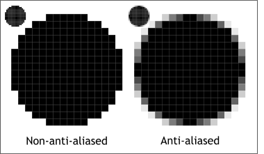
The circle on the left is non-anti-aliased, that is a long way of saying, it has not been softened. The circle on the right has been Anti-aliased using intermediate shades of gray to soften the hard black outline against the white background. When we reduce the size of the two bitmap circles as shown to the top left of each circle, we can see the smoothing effect. The Anti-aliased circle actually looks sharper than the circle on the left. Anti-aliasing not only smoothes the outline of the shape, it also makes the edges appear sharper. |
|
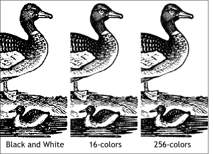
The duck was scanned from a black and white image. With just black and white, the image is ragged. If we increase the number of colors to 16, the image appears smoother. Increasing the number of colors to 256 makes only a very subtle difference. |
|
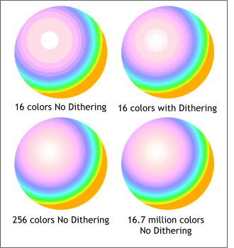
Dithering is a process of making tiny patterns using a small number of colors to give the impression of more colors. The top, left circle was exported to bitmap using only 16 colors. (It is the same circle shown in the lower right corner). Because of the limited number of colors, the circle solid shows bands of colors. The top right circle was exported to bitmap with the same 16 colors, but this time dithering has been applied making the banding less obvious. At 256 colors, there is not as much need for dithering.
Adding more colors, as seen on the two circles shown below, eliminates the need for dithering. The more colors we have to work with, the smoother the results. The bottom right image is also called True Color and utilizes a palette of 16.7 million colors. |
|
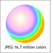
Notice the highlight area on the GIF image is showing some banding while the highlight on the JPEG sphere is smooth. Even though the JPEG uses more colors, the JPEG file is 7K vs. 9K for the GIF. And the JPEG looks better too. So the next logical question is when should you save a file as a GIF and when should you save a file as a JPEG? The general rule of thumb is images that contain mostly solid areas of color, or images that contain a lot of text, should be saved as GIF files. Also, Web images that require transparent backgrounds, should be saved as GIFs because at the current time, JPEG images do not support transparent colors. PNG (pronounced ping) files can have transparent backgrounds, but are not supported by older browsers. Images that are photographs, or that contain subtle gradations of color, such as the sphere, look better, and produce smaller file sizes, when saved as JPEGs. |
|
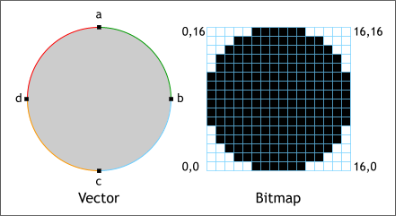 Xara is a vector graphics application that
can perform some operations on bitmap objects. Confused? Well on the left are two examples of a circle, the one on the left is a vector circle while the one on the right is a bitmap.
Here's the difference. Vector objects are defined by their outlines. So the vector circle can be described in terms of four points with an arc connecting each point. After the outline is defined, we can also define
the circles fill, RGB 204, 204, 204 or Hexadecimal CCCCCC. And finally, a vector object is defined by its location on the page.
Xara is a vector graphics application that
can perform some operations on bitmap objects. Confused? Well on the left are two examples of a circle, the one on the left is a vector circle while the one on the right is a bitmap.
Here's the difference. Vector objects are defined by their outlines. So the vector circle can be described in terms of four points with an arc connecting each point. After the outline is defined, we can also define
the circles fill, RGB 204, 204, 204 or Hexadecimal CCCCCC. And finally, a vector object is defined by its location on the page.
 A word you hear a lot, in reference to bitmaps, is
Anti-aliasing. This is a process of softening the hard edges of bitmap objects and text objects to make them appear less jagged around the edges.
A word you hear a lot, in reference to bitmaps, is
Anti-aliasing. This is a process of softening the hard edges of bitmap objects and text objects to make them appear less jagged around the edges.
 The more colors we have to work with
(up to a point) the better Anti-aliasing works as you can see in the three examples on the left.
The more colors we have to work with
(up to a point) the better Anti-aliasing works as you can see in the three examples on the left.
 Another term we hear a lot when creating bitmap images
that are limited to a maximum of 256 colors, is dithering.
Another term we hear a lot when creating bitmap images
that are limited to a maximum of 256 colors, is dithering.
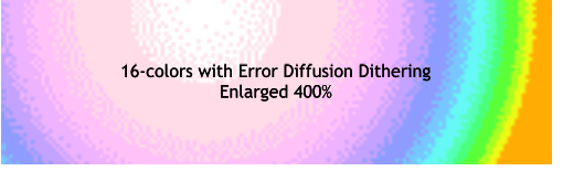 Shown on the left is a section of the 16 color
dithered image showing the Error Diffusion patterns created by the dithering process. The patterns create the appearance of more colors by placing the patterns over solid colors.
Shown on the left is a section of the 16 color
dithered image showing the Error Diffusion patterns created by the dithering process. The patterns create the appearance of more colors by placing the patterns over solid colors.
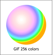
 Here is the same sphere saved as a 256 color GIF (left) and as a 16.7 million color JPEG image (right). Both are bitmap images.