|
|
|
I was asked to design a logo for a local home builder doing business under the rather grand name, American Quality Builders. Posted here are my five favorite designs. I'll tell you after I present the logo designs which design the client picked.
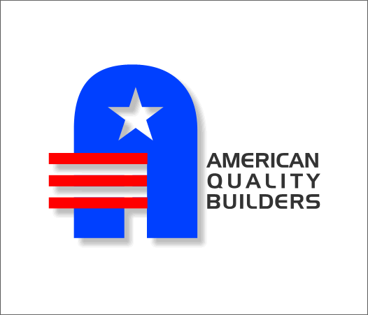
This design was made entirely from scratch with the exception of the Zapf Dingbats star which was subtracted from the A shape. The text font is Handel Gothic.
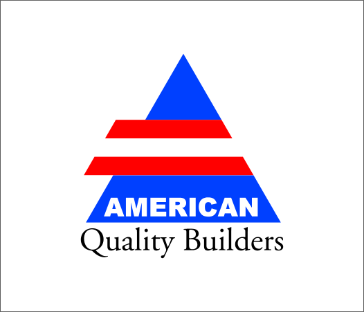
The QuickShape Tool was used to create the triangle. The two fonts used are Arial Black and Adobe Garamond. I liked the play of bold and elegant that the two different fonts provide.
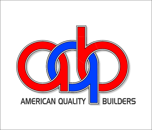
This design used the over and under technique which is spelled out in detail in Christine Farrelley's Celtic Knot Guest Tutorial. I made three shapes for each letter which were created from a 1-step contour for each character. The outline was converted to a shape (Arrange > Convert Line to Shape), then a solid white shape in between, and on top the character itself. A shape covering the overlap of a duplicate character was made, sent to the back, and the duplicate character masked into the shape using the Apply Clip View command.
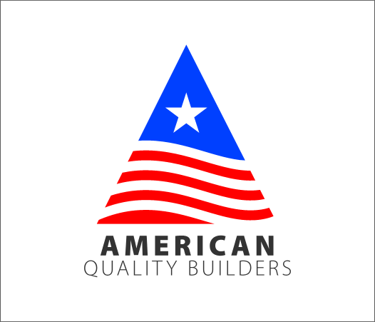
The QuickShape Tool was used to create another triangle. A blend of two wavy lines was created. The Outline Width of the wavy lines for the blend was increased to about 12pt and the lines converted to shape.
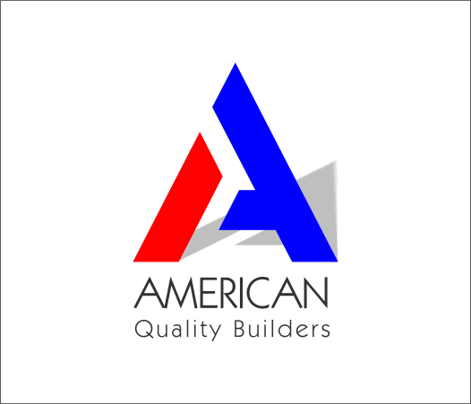
This is my favorite design although it is not an original design but rather an existing font, Glaser Stencil created by one of the greatest designers of the past 50 years, and the founder of the Push Pin Studios in New York, Milton Glaser. My contribution was to Convert the A to Editable Shapes, Ungroup twice, then break shapes and color the two elements separately. The font used for the text is Kabel Book, and oldie but goodie font. A Floor Shadow added a nice sense of direction. So which design did the client pick? Which design would you pick? The answer is none of the above. He decided to stick with his Uncle Sam logo. But you know, nothing ventured, nothing gained. I love doing logos and even though the client did not like any of the designs, I had fun creating these designs and I'm proud of each and every one. If you would like to purchase any of these designs I will make you a offer you can't resist. So we come to the end of another Workbook. Time certainly flies when you are having a good time! Comments and questions are always welcome. You can use the form on the next page to evaluate the tutorials and send me your feedback. I try to answer every response. Gary W. Priester
|
||
|
|
