|
|
|
|
|
||||
 |
|||||
|
Most vector applications have built in tools for creating pie charts Xara being the notable exception. But this does not mean with a little enterprise we cannot create a 3D pie chart in Xara.
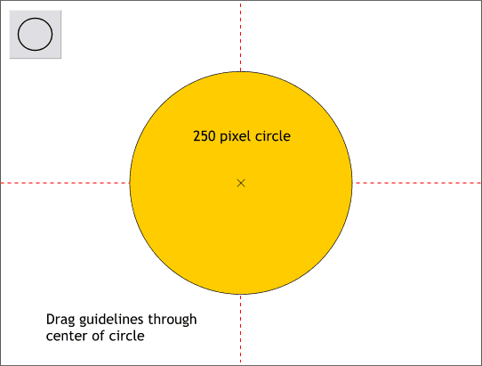
Step 1 Drag a vertical and horizontal guideline from the screen rulers onto the screen (Ctrl L to display the screen rulers). Click the Ellipse Tool at the intersection of the two guides. Press and hold the Shift and Ctrl keys and drag a circle approximately 250 pixels in diameter. (The Ctrl key constrains the ellipse to a circle and the Shift key forces the circle to be drawn from the center).
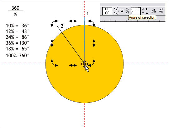
Step 2 Using the formula 360 (the degrees of a circle) divided by the percent of the individual pie slice, I have determined the degrees each pie slice will require. These are shown to the left above. These can be modified as needed. Using the Shape Editor Tool, or the Pen Tool (your choice), click at the intersection of the guides then click a bit above the top of the circle on the vertical guideline to create a vertical line. (You might want to set the View Quality to Outline (Window > Quality > Outline) to see the guides which are hidden behind the circle). (Adding temporary Flat transparency will also allow you to see the guides). Make sure the starting control point of the line is exactly on the intersection of the two guide lines. Click twice on the line to enable rotate/skew mode. Drag the rotation bulls eye to the intersection of the two guide lines. Clone the line (Ctrl k). In the Angle of Selection text entry box (shown above), key in 36 and press Enter. The cloned line is rotated counter clockwise 36 degrees from the center of rotation (the bulls eye).
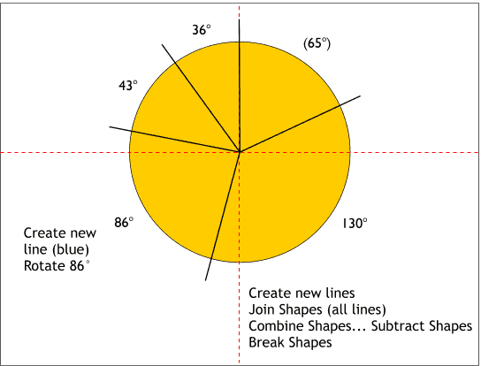
Step 3 Cone the new line and enter the second value, 43 and press Enter. Continue cloning the newest line and entering the values shown above. You do not need to enter the last value (65) as that will just create a line over the first line we created. Select all the lines (hold down the Shift key and click on the lines to multiple select them). From the Arrange menu, select Join Shapes. Select the joined lines and the circle and from the Arrange menu, select Combine Shapes... Subtract Shapes. Then from the Arrange menu, select Break Shapes. You now should have five separate pie slices. (Do not use Slice Shapes for reasons that will be obvious if you do).
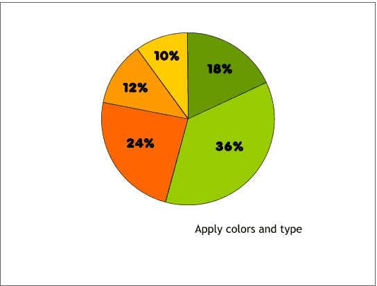
Step 4 Select each pie slice and give it a different color. Using the text tool add the percentages as text as shown. I have used the font Valken which is in the Fonts folder on the Xara X CD. Visually center the text over the pie slices.
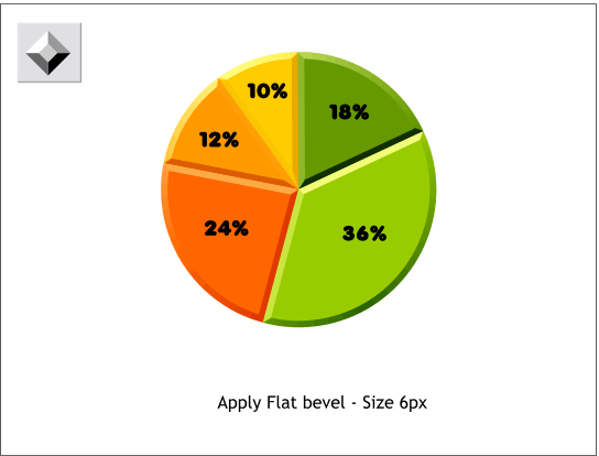
Step 5 Select all the pie slices. Select the Bevel Tool and select Flat from the drop down list of Bevel Types. Select Size from the Slider Types drop down list and change the size to 6px and press Enter.
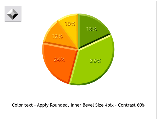
Step 6 Apply the same color to the text as used for the pie slice. Select all the text and apply a Rounded, Inner Bevel (press the icon with the arrows facing the center). Change the Size to 4pix and from the Slider Types drown down list, select Contrast and change the slider to 60%. Really cool pie charts have one of the slices removed and raised over the rest of the chart. We can do that! Here's how.
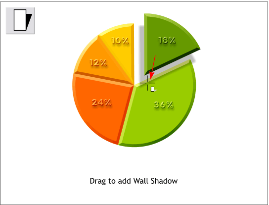
Step 7 Select one of the slices and its text and move it as shown. Select all the text, select the Shadow Tool and apply a Wall Shadow by pressing the Wall Shadow icon on the Infobar. Deselect everything. Then using the Shadow Tool, drag downwards on the raised slice to add an interactive shadow and drag the shadow down and left as shown.
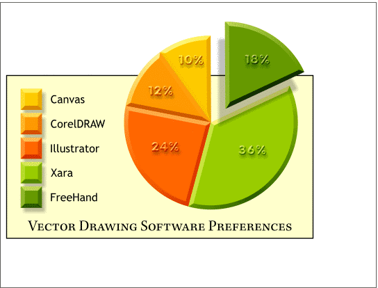
This illustration shows how handsome the pie chart looks when you put all the elements together. I created colored squares the same color as the corresponding pie slices for a legend and applied the same bevel and Wall Shadows. In my chart, Xara is the clear winner in the pie chart creation category! |
|
