|
As this is such a complex illustration, there simply isn't the room here to walk you through the entire work. Therefore I propose to talk you through some of the
techniques used in parts of the illustration. I'll start with the wheels - this is for two reasons:
- They were only the second layer to be completed yet almost instantly gave me a taste of the finished work (that enthusiasm thing again!)
- They include areas of chrome which have traditionally been areas many people have had problems with
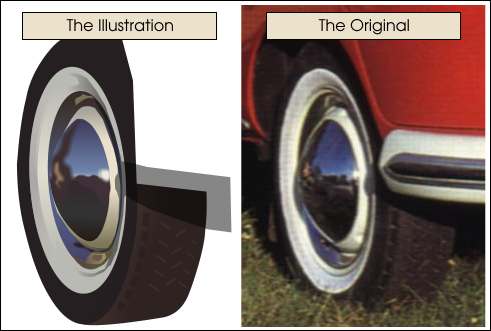 As you can see above, the detail on the drawn wheel is less complex than the enlarged area from
the original photo. This is entirely up to you and very much depends on the final resolution at which you wish to display your finished work (i.e., are you creating this image for a billboard
or a web site?). Even at 1024x768 my Splittie image looks good, but as an advertising banner splashed on the side of a bus, people waiting at the bus stop would soon see its flaws! Let start work on the front tyre and
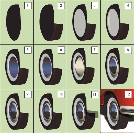
work our way forwards to the highlights on the hubcap. As you can see, I make no pretense whatsoever of acknowledging the actual shapes of what I am drawing - I am simply drawing what I see and in so doing am forcing
myself to ignore the reality of the shapes I am trying to effect. All four wheels were drawn on one layer, but there is no reason why you should do this other than to keep your Layer Gallery manageable. As you can see above, the detail on the drawn wheel is less complex than the enlarged area from
the original photo. This is entirely up to you and very much depends on the final resolution at which you wish to display your finished work (i.e., are you creating this image for a billboard
or a web site?). Even at 1024x768 my Splittie image looks good, but as an advertising banner splashed on the side of a bus, people waiting at the bus stop would soon see its flaws! Let start work on the front tyre and
work our way forwards to the highlights on the hubcap. As you can see, I make no pretense whatsoever of acknowledging the actual shapes of what I am drawing - I am simply drawing what I see and in so doing am forcing
myself to ignore the reality of the shapes I am trying to effect. All four wheels were drawn on one layer, but there is no reason why you should do this other than to keep your Layer Gallery manageable.
|