|
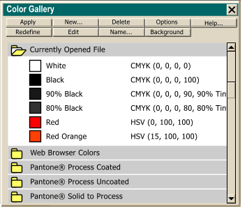  The first gallery in what I like to call gallery row, is the Color Gallery.
The Color Gallery can be used to manage the colors displayed in the screen palette. Colors can be added or deleted, redefined, and edited. You can sort colors using a primary and secondary sort criteria, locate
colors by name, and see the properties for a selected color. The first gallery in what I like to call gallery row, is the Color Gallery.
The Color Gallery can be used to manage the colors displayed in the screen palette. Colors can be added or deleted, redefined, and edited. You can sort colors using a primary and secondary sort criteria, locate
colors by name, and see the properties for a selected color.In addition to all the named colors (red, orange, yellow, etc.) listed in the order they appear on the screen palette,
colors applied to objects from the web safe color section of the screen palette appear in the list of colors. At the bottom of the Color Gallery are four additional folders, Web Browser Colors
(displayed by default to the right of the named screen palette colors, Pantone Process colors in Coated and Uncoated versions, and Pantone Solid to Process, which I believe are in fact
Pantone Spot Colors. Web Browser colors can be easily identified by their diamond shape. Pantone Solid to Process colors are identified by their round shape.
|

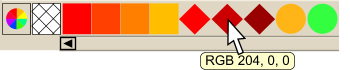 Named colors (red, orange, etc.)
appear on the left side of the screen palette and are identified by their square shape. Web Browser colors are identified by their diamond shape. Pantone Solid to Process colors, when they appear in the
Color Gallery, or on the Screen Palette, are designated by their round shape. Whenever a Web Browser color from the screen is applied to a selected object, or a Pantone color is applied from the appropriate folder in the
Color Gallery, a copy of the color is placed just to the right of the named colors on the screen palette, making it easy to apply this color to other
objects. If you let the cursor rest over any color on the screen palette for a few seconds, a tool tip appears with the name of the color or the color properties.
Shown in the tool tip shown above are the RGB components of the dark red color. RGB colors can also be specified in percentage (vs. 0-255) by selecting Percent in the Color Units radio button in the Units
tabbed section in the Page Options dialog (Utilities > Options).
Named colors (red, orange, etc.)
appear on the left side of the screen palette and are identified by their square shape. Web Browser colors are identified by their diamond shape. Pantone Solid to Process colors, when they appear in the
Color Gallery, or on the Screen Palette, are designated by their round shape. Whenever a Web Browser color from the screen is applied to a selected object, or a Pantone color is applied from the appropriate folder in the
Color Gallery, a copy of the color is placed just to the right of the named colors on the screen palette, making it easy to apply this color to other
objects. If you let the cursor rest over any color on the screen palette for a few seconds, a tool tip appears with the name of the color or the color properties.
Shown in the tool tip shown above are the RGB components of the dark red color. RGB colors can also be specified in percentage (vs. 0-255) by selecting Percent in the Color Units radio button in the Units
tabbed section in the Page Options dialog (Utilities > Options).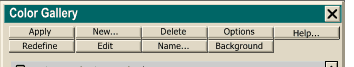 The buttons at the top of the
color gallery dialog perform a variety of functions related to the Color Gallery.
The buttons at the top of the
color gallery dialog perform a variety of functions related to the Color Gallery. 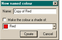 New... Creates a new Named color. In order for the New... button to be operational, and not grayed out, you need to first select a color (from the list of colors found in the
Color Gallery) that is close to the new color you wish to create. Then click New... The New Named Color dialog opens (shown here).
New... Creates a new Named color. In order for the New... button to be operational, and not grayed out, you need to first select a color (from the list of colors found in the
Color Gallery) that is close to the new color you wish to create. Then click New... The New Named Color dialog opens (shown here).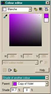 In either case, as soon as you press Create, the Color Editor (shown on the left) opens automatically enabling you to modify the color. The new color appears in the Color Editor
along with the name you have given to it.
In either case, as soon as you press Create, the Color Editor (shown on the left) opens automatically enabling you to modify the color. The new color appears in the Color Editor
along with the name you have given to it.