|
|
|
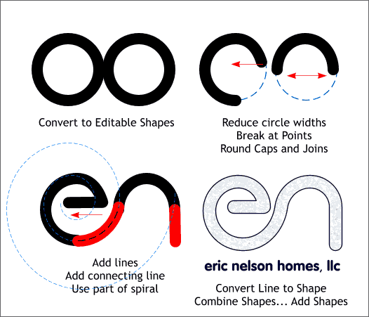
For the next design, 2 circles were created. The widths were reduced to about 95%. The circles were Converted to Editable Shapes, and sections of each removed using the Break at Points feature of the Shape Editor Tool. I used a section of an Exponential Spiral (using Dmitry's Sprial X utility) to create the transition from the e to the n shape. All lines were converted to shapes (Arrange > Convert Line to Shapes) and then combined into one outline using Arrange > Combine Shapes... Add Shapes. A Paper 17 fill was added from the Fill Gallery, Background Textures folder.
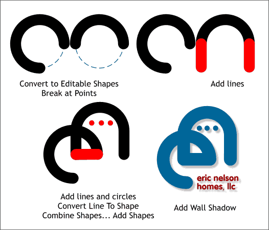
This logo uses some of the same techniques from the last design. This is my favorite designs of the series.
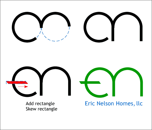
This design also uses the previous techniques. The cross member on the e is a rectangle which was skewed and then combined with the other shapes.
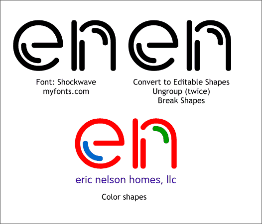
This design uses the font Shockwave which can be purchased from myfonts.com. The font was converted to Editable Shapes, Ungrouped twice, and then Arrange > Break Shapes was used to break the parts of the font into individual objects. Color was applied to the individual objects.
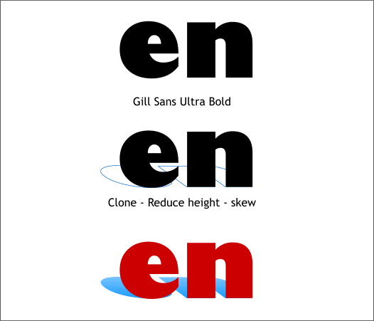
This is another font treatment using Gill Sans Ultra Bold. A Clone was created, resized and skewed to make a drop shadow to which a Linear fill was applied. If this logo is printed as 2 spot colors the linear fill cannot use white as white is a RGB colors and will not work.
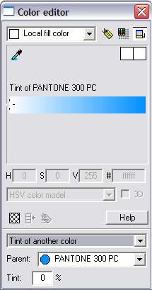
Instead of white, the start and end color are both Pantone 300 PC. The end color was edited in the Color Editor (Ctrl e) using the Tint of Another Color option and the Tint % changed to 0% . Preview this in Window > Show Printer Colors and you will see it is all one Spot color.
Continued on Next Page >
|
||
|
|
