|
|
|
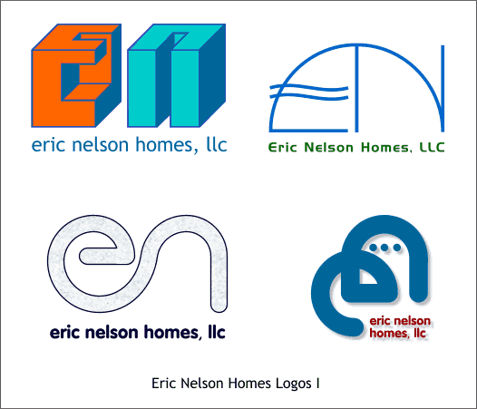
Last month we looked at some techniques for creating a simple logo. And in my humble opinion, simple is always better. A few weeks ago I was asked to design a logo for a local new home builder, Eric Nelson. I created 8 designs for Eric to review. All of these designs were simple stylized type treatments of Eric's initials, EN. I will review the designs and explain how each was created.
Here are the first 4 logo designs.
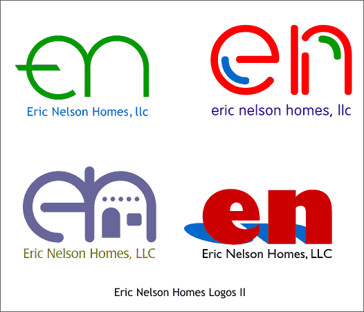
And here are the last 4 designs. The client has not decided on any of the designs at this point. The logo in the lower left in the above group reflects a few of the southwestern design elements including the arched doorway and exposed vigas (beams) that are seen on most Pueblo-style homes.
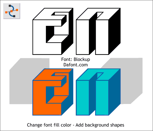
One of the first things I do when designing a logo is to audition type faces and see if by luck there is a font that works. The above logo uses a fun font called Blockup which is free from DaFont.com. Using the Shape Editor Tool, 2 shapes were created using the basic outline of the characters (the 2 shapes are shown in gray). (The white portion of the characters is actually transparent). The shapes were colored, and sent to the back. The Fill color of the font was changed. Simple solution.
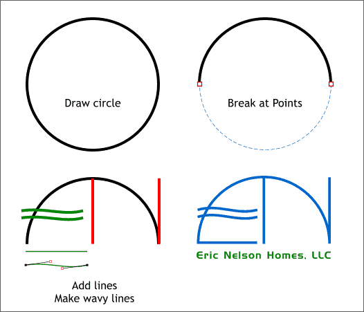
A circle was Converted to Editable Shapes. Using the Shape Editor Tool, the two middle control points were selected and the Break at Points icon pressed on the Infobar. The bottom half of the circle was deleted leaving an arc. 2 vertical lines were added (red). A horizontal line (green) was shaped into an S-shape with the Shape Editor Tool and duplicated. All lines were converted to shapes Convert Line to Shapes and then combined Combine Shapes... Add Shapes producing one combined shape.
Continued on Next Page >
|
||
|
|
