|
|
|
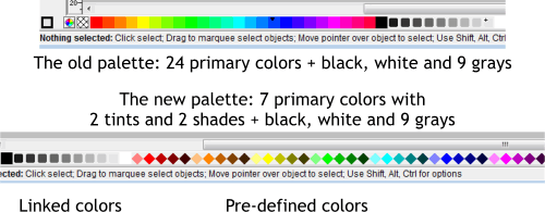
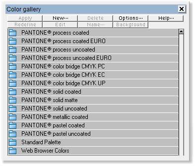
Let's begin with the new color palette. On the top of the above image is the old palette that we all know and love(d). It consists of 24 primary colors, black and white and 9 shades of black. Also included were 216 Web Browser colors. And while web safe browser colors, which were designed to look the same on any 256 color computer monitor, are no longer relevant, the palette did provide additional colors to work with. Pictured at the bottom of the above image is the new palette. The number of primary colors has been reduced to 7 but two tints and two shades of each primary color have been added. These colors are now referred to a Predefined Colors and are now indicated by the diamond-shaped color swatches. Named Colors now appear as squares. Linked Colors, such as the 9 tints of Black are indicated by smaller rounded squares. Gone are all the web browser colors. Well, not actually gone. They are in the Color Gallery if you want to use them. But they are missed (at least by your editor) on the screen palette. Here's the entire contents of the Color Gallery. And see the Web Browser Colors are still there. Only they don't display on the color line. Along with the Standard Palette there are 13 Pantone Color folders. This is pretty incredible. Remember, most of these Pantone colors are intended to be used as specially mixed solid inks and specified from special Pantone swatch books. Now I don't know about you, but I came to know and love the old primary color palette. I used certain colors as the base colors for things like green glass, cool silver, sky blue, shiny brass, and other effects. I'm not sold on the new Standard palette. Just yet. Perhaps maybe never. So, here's what I did.
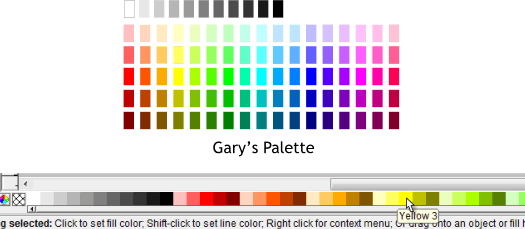
I came up with my own palette of colors. After much experimenting I decided on 17 primaries, plus black, white and 9 shades of black. Each primary has two tints (lighter versions) and two shades (darker versions). My lightest tints are lighter than the new Standard palette and my darkest shades are a bit lighter than the Standard palette's. I have saved this palette as a Template file and have made it my default template. I am generously offering to share this palette (as in FREE) with anyone who feels the lack of choice with the new Standard palette! Click here to download my custom palette. Open the XAR file and save it as a Template (File > Save Template...) If you save this as a template, do not delete the small palette of colors that are above the page. These colors that I have painstakingly individually named and numbered, are necessary to display the colors in the color line (the screen palette). Repositioning Named Colors Not that you will want to, but if for example you would like the shades and tints to go from dark to light, you can drag and drop the colors to a new location or order. You cannot do this with the Standard palette colors however. Only with Named Colors.
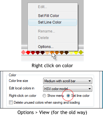
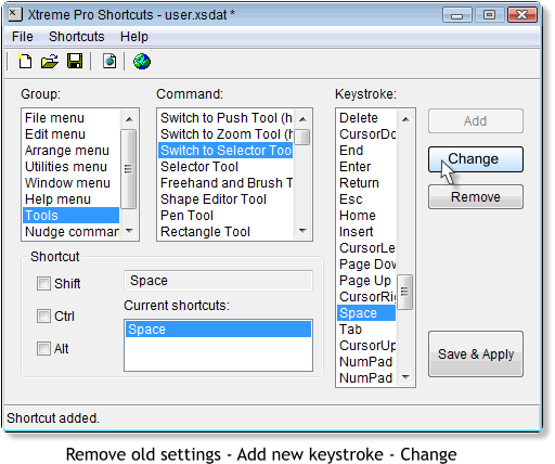
Now here is something that really makes me a difficult person to be around (just ask my long-suffering wife). Remember in every previous version of Xara you left click on a color to apply a fill and right click on any color to apply an outline color? Well not any more. Now when you right click on a color you get a pop up menu (shown above) asking if you want to Set the Fill Color or Set the Line Color. Xara explained this to me as making it easier for new users. That's fine. But how about all us grumpy old users who don't like change? There's more. If you have selected a bitmap image, and you right click on a color, you get a pop up asking if the color you just clicked is for the lighter or darker Contone color. And remember how easy it was to set the fill or outline color to none by clicking on the crosshatched box to the left of the screen palette? Now you get the third degree. Fortunately you can still left and right click on the tiny color wheel icon to the left of the cross hatched box to open the Color Editor. I suspect, anticipating a user revolt, Xara added an Options... selection at the bottom of the pop up menu. This takes you to the Page Options > Veiw menu where you can opt to revert back to the old way. Just check Set Line Color. To be fair there is some good thinking behind this. Remember clicking on a fill color for a path and nothing happening? Well Xara now automatically changes the fill color to an outline color without making you feel dumb. And if you get used to it, you could just always right click on a color and select Fill or Outline from the menu. But why? It is useful for Contoning an image however because I can never remember if it is the outline color that is the dark or light color. There is another option while we're here, Delete Unused Colors. If you are like me, you often create a lot of new named colors but you don't always use these. And after a while the screen palette starts to resemble a dog's breakfast (not a pretty site). And when you reopen one of these documents the palette is still cluttered with these unused colors. If you check Delete Unused Colors when you close your document, Xara will dutifully delete all of your unused colors. (Don't select this if you are using my custom palette, however). DON'T TOUCH MY SPACEBAR! All in all I think the changes made in version 3.2 are pretty incredible. They are useful and improve the product considerably. Especially the new text handling options. But there is one change that absolutely makes me an even more very unpleasant individual. I'm sure you know what I am talking about if you have downloaded the new trial version and pressed the Spacebar to toggle the Selector Tool or to toggle back to the last used tool. I mean along with left and right clicking on colors on the screen palette the Spacebar/Selector Tool/Last Tool Selected is how it has always been done. It's sacred! I'm not sure what they were thinking, but Xara for whatever reason has changed the Spacebar behavior to toggle the Push Tool ! The Push Tool! Can you believe it? The explanation from those in the know at Xara is that this is how Adobe Illustrator handles the Spacebar shortcut. And more than that, the Push Tool is the most used Illustrator shortcut! Yeah, OK. Swell! What does this have to do with me? I use Xara Xtreme Pro because it is so much better than Illustrator. You know? Well fortunately for us grumpy old Xtreme Pro 3.2 users there is a way back. Rubem Pechansky's Shortcuts utility which comes with Xtreme Pro. It is in the Xara > Xtreme Pro folder. I have pinned Shortcuts to the Start menu. Here's how to restore the Spacebar to the function it was always intended to have. Select Tools, Switch to Selector Tool and then select highlight the current shortcut in the Current Shortcut window and press Remove. (Good riddance!) From the Keystroke list, select Space and press Add, and press Change. Then press Save and Apply. You will be asked to restart Xtreme Pro for the changes to take effect. It's a small sacrifice. Believe me. Having control back over the hallowed Spacebar is well worth it and restores my humor.
Your comments and feedback are greatly appreciated. Please use the Send e-mail link at the bottom of this page to send me your comments and questions. Gary W. Priester |
|||||||
|
|
|||||||
|
|
|||||||
