The Logo Gallery — Paul Söderholm
Logo design by Paul Söderholm

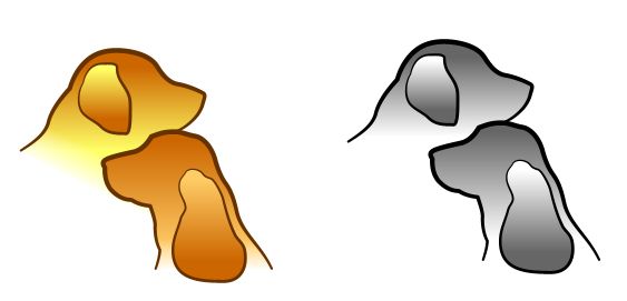
Dog Show 2003 The logo was made for a coming dog show in January. I used a couple of photos of a golden retriever and an English cocker spaniel as model. With the shape tool I made the outlines of the dogs and applied suitable brush strokes.

The logo was made in two versions: one for colour purposes (ie broschures and posters) and one for black & white (ie office printing and copying).

Logo design by Paul Söderholm

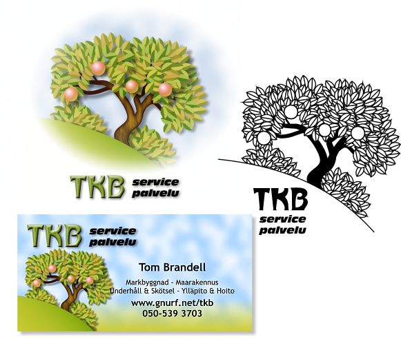
TKB service This concept was made for a gardener friend of mine, who recently started his own gardening firm. I made a custom brush for the leaves which was used for the tree and the bushes. I used the font Metropolitaines as I found its forms quite organic like tree trunks and such.

For the black & white version I had to convert the brushes to shapes, so I could them a black outline. If someone wonders about the text "service / palvelu" it is because Finland (still) is bilingual and "palvelu" is Finnish for "service" (which is the same in both Swedish and English).

Logo design by Paul Söderholm

PCG The concept was made for a research group at the Åbo Akademi University. A couple of "institutions" of the chemistry-technical faculty joined to a single research group -Process Chemistry Group - and needed therefor a new logo and look. The university colours are black and yellow, and the faculty colour is green, so I started from those colours. The group had been accepted by the Finnish Academy (kind of a head organisation of all universities in Finland) as a "centre of excellence" research group. I suggested that a chemical molecule symbol could be suitable, and the professors suggested this"flash" shaped symbol of a molecule which they for some reason find very interesting and intrigueing (don't ask me about it, I haven't studied chemistry since school about 20 years ago).

Anyway, the molecular symbol they suggested was perfect: it looked a bit like a flash (for power and dynamics) and it pointed upwards (for success). And the colours I mentioned fitted in as well.

So what you see here is the letterhead, business cards (the group members can choose either a vertical or a horizontal model), the main logo and a black & white sticker


Paul Söderholm
Freelance graphic artist & designer
email:
paul@gnurf.net
digital portfolio:
www.gnurf.net/portfolio