![]()
![]()
![]()
![]()
![]()
![]()
![]()
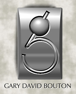 G99 I needed a logo for the next millennium, so this is it. What I did from a conceptual point of view is try to reduce a lowercase "g" to very simple, almost Art Deco components. This then allowed me to play with the texture of the piece, which is a slightly dulled metallic finish. You add shadows to the piece, and you've got a slightly weird but visually interesting design. At least two people have mistaken this for a photo of some jewelry. DO NOT ever doubt that you can create something photo realistic in XARA!!!