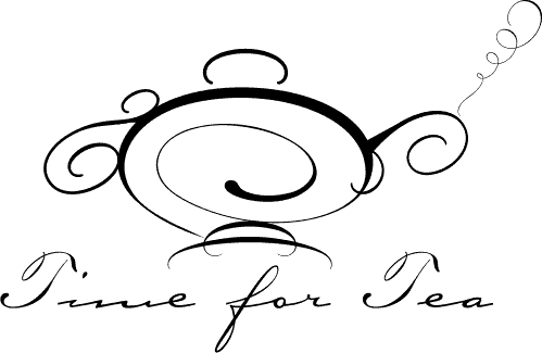
 Time for Tea logo
I never ask people what they want a design to look
likebut how they want it to feel. Stacey Vornbrock created a unique service where she goes to homes, offices or events and sets up elegant high teas. Her instructions were to create something elegant, formal, traditional, yet also
modern. I have to say I was stumped for a while. I kept looking for teapot illustrations, and there just weren't any I
thought worked. I often start with typefaces to give me the direction, and so I looked at a lot of formal script faces.
One of my favorites is a new one from Adobe called Bickham Script. It's a multiple master face, so it gives you a lot of control over weight. But what really intrigued me was the ornaments face, which had a lot of
wonderful calligraphic swashes. I remembered seeing old illustrations that were done with a pen like calligraphy. So I put ornaments on the page and started to move them around, and pretty soon I had what looked like a teapot. My first version was good, but my wife, who always makes great suggestions, said, "it needs more of a base" and we worked together and this finally emerged. The typeface used for the type is actually Carpenter, from