 |
|||||||||
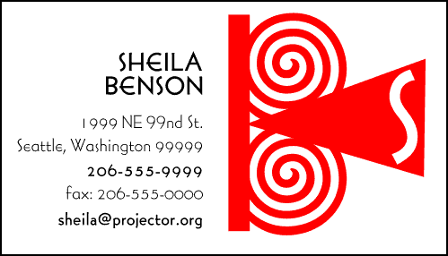
Sheila Benson logo and card Here's a card and logo I designed for a film critic. I liked the simple, abstract, fun shape that implied a film projector, projecting her initial. She opted for an even more abstract design, which I liked, too (I never let a client have anything I don't like myself!). The typeface is Berhard Gothic, a little known but quite beautiful art deco sans serif face from fonthaus it uses the alternate version for the E's so that they're rounded.
|
||